The Art of Movie Posters
An interview with artist Aleks Phoenix on The Substance, Agencies, and his inspiration
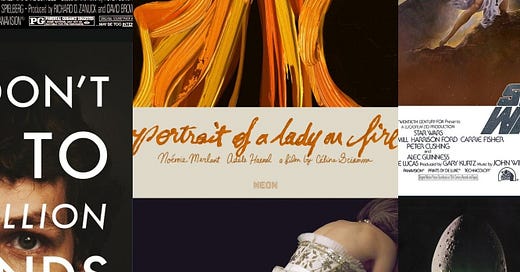
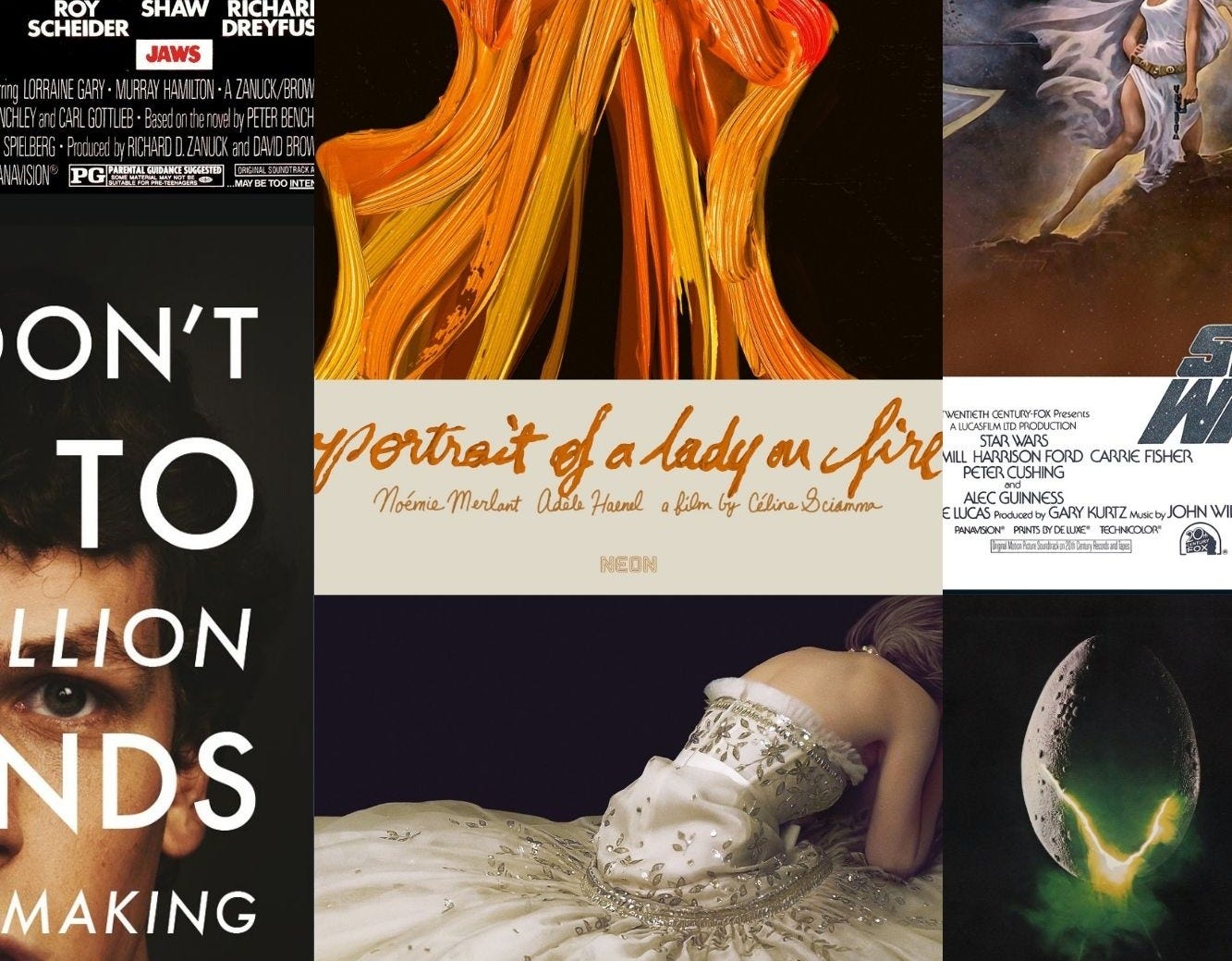
Earlier this week, I ran a feature on movie trailers and I thought that it’d be nice to follow that up with an interview about the art of movie posters. Normally in the promotional cycle of a movie, you’ll see the release of the poster exactly one day before the trailer debuts. They go hand in hand. While a lot of the blockbuster movie posters these days have floating heads because studios believe what they are selling with these movies is star power, there are still opportunities for some truly inspiring art.
Those places are typically through art collectives like Mondo, a company that connects illustrators with licensors, to create one-of-a-kind movie posters. Or through smaller indie studios like A24 and Neon, who still work with marketing agencies, but seem to have more freedom in how they market a movie. I’m not sure how much of that is my perception compared to reality, but I find these smaller studios willing to take more artistic approaches.
Surprisingly one website where movie posters continue to make a big impression is Letterboxd. Letterboxd allows film lovers to review and log their movies, but it also maintains its database of movies, with the posters that have been released. An acquaintance of mine, Ella Kemp, did a feature on posters for Letterboxd that I found pretty neat. The movie poster helps define the movie for an audience and not only shows up on marketing material but can be considered a vital piece of the impression a movie will make.
One movie poster artist recently caught my attention through his stunning ‘fan work’ creations. Aleks Phoenix was inspired to take sequences from trailers and create his own version of a poster. Now he gets work doing what he loves—creating original posters for movies all over the world. Phoenix still loves making his fan art, sometimes even impressing the directors of the films.
I connected with Aleks through a Zoom call and I’ve shared our conversation below. It has been edited and condensed.
Max Covill: I was looking at some of your work. So, you have professionally commissioned posters, right?
Aleks Phoenix: Yeah, I do both commissioned and fan work.
MC: Most of your portfolio seems to be tribute posters.
AP: Yes, I’m very prolific with tribute posters, but I’m also a full-time poster designer. I share a lot of my work on social media, but it all gets mixed up.
Max: I saw on one of your portfolio sites, Poster Spy, that you’ve transitioned into poster design within the last three years. What inspired you to focus on movie posters as opposed to other fields?
AP: I’ve always loved cinema. As a child, I wanted to be a filmmaker, but my career took a different path. I studied graphic design but dropped out in the last semester because I was frustrated with the university curriculum and the craft itself. Eventually, I ended up as a graphic designer and realized how much I love editorial design and advertising.
Posters became a way to combine everything I love about design—typography, photography, and conveying a striking message. During the pandemic, I started creating posters as a hobby to keep busy, and I just kept going from there.
[ed note: some of Aleks favorite posters he’s worked on shared on his Instagram]
MC: Has your passion for posters led to commissions for films and TV shows?
AP: Yes, it has. At the time, I had a full-time job, but commissions started coming in. At first, I wasn’t sure how much to charge or how the process would work. Most of my early clients were international, not from Mexico. That was cool because I was engaging with filmmakers worldwide.
I wasn’t getting a lot of commissions, like maybe one commission per month or something like that. It wasn't enough to pursue this as a full-time career, but it was enough to get me thinking about it.
MC: I’ve been looking at your portfolio, and I see that you often work with stills from movies. Can you explain your design process?
AP: My process is pretty similar for both alternative and official posters, but there are differences. For fan posters, I usually get inspired by trailers. For example, when the trailer for Tar dropped, I started making a poster the very next day. My process starts with just feeling so excited about something that I feel like I want to create. I research the film, watch the trailer repeatedly, and select a frame that speaks to me. I don’t sketch—I’m not an illustrator myself. I just started working in Photoshop and playing around with color and type.
For official commissions, I receive a brief and references from the client, and sometimes I get to watch the film early. I meet with the filmmakers to discuss the vibe of the film and then start designing. There’s more pressure with client work, but with fan posters, I am very free to do whatever I want.
MC: I saw your international poster for La Quimera (La Chimera.) Was that with Neon?
AP: No, it was for Cine CanÃbal, the Mexican distributor. They liked my previous work and asked if I wanted to create an official alternative poster for the Mexican release. I was thrilled because that's the kind of work I love.
MC: Do you prefer working with indie companies, or are you open to bigger studios?
AP: In 2022, I worked with big agencies in LA like Lindeman & Associates and GrandSon. I was over the moon when they reached out because I had limited experience with poster design. They told me they wanted to incorporate my vision and arty type-oriented style into their projects. However, the work pace was intense—they required multiple comps in a short time, and none of my work got selected. I was one art director out of 100. It was a learning experience, but I realized that my strengths lie in more independent projects, where I can work closely with filmmakers.
MC: It sounds like working with those agencies was intense. Moving on, I’m a big fan of movie posters and quite fond of the documentary 24x36 that came out a few years back. Are you interested in selling prints of your work, like what Mondo does?
AP: I’ve been asked about prints a lot. I tried selling them through Etsy when I started, but it was too much hassle with shipping and fees. I sold a few, but it wasn’t profitable. When I see other creators selling prints, they are illustration pieces in collaboration with Mondo or other similar collectives. I’ve never been contacted by any [art collectives], and I know my work is not precisely in that realm. I’ve been told that unofficial sellers are selling my poster art on Etsy, Amazon, and eBay. I prefer to make my income from making official posters, not selling my alternative ones.
However, after the success of my The Substance poster, I’m planning a limited print run, maybe with numbered posters or my signature. I’d be working with a specialized printing workshop here in Mexico City. My Mulholland Drive poster has also been highly requested for print as well. A couple of times I’ve sold the digital file, but I felt awkward because I don’t like to sell my highest res file and then it’s suddenly out in the world. I haven’t figured out exactly the best way to do it yet.
MC: What are some of your favorite designs, and are there any artists who inspire you?
AP: Akiko Stehrenberger is one of my favorite poster artists. Her work has been a big influence on this generation of poster creators. [ed note: Stehrenberger’s Funny Games poster (pictured below) has received a lot of acclaim over the years. It is also featured in this Vanity Fair article from 2014 and named among some of the greatest graphic movie posters of all time.] Another favorite of mine is Stephen Frankfurt, who designed the posters for Alien and Rosemary’s Baby. Their use of minimalism, type, and negative space is something I admire.
MC: We talked a little about Marvel movie posters earlier. Do you feel that modern studio posters rely too much on big faces and lose the artistry of older designs?
AP: Yes, I think studios often underestimate audiences and feel they need to be overly clear and polished. This approach kills the artistic, teaser-style posters that are used to evoke the film’s emotional or thematic depth. I’ve been told that people like my posters because the posters convey how the movie makes you feel. We rarely get the vibe of the film from modern movie posters. I think many modern posters are losing that touch.
You can support free interviews like this one with a paid subscription to It’s the Pictures.
If you’d like to read the interview on movie trailers you can click below: